
I made the case in an earlier article that gamification programs have to begin and end with business objectives. Thus, measurement is critical to understanding the return on your investment. This is the first in a series of posts in which I will propose some ways to measure both the health of the gamification program as well as its impact on key business metrics, and I will also try to steer you clear of common pitfalls in reporting and analytics.
Part 2 discusses how to get more out of table-stakes reports with gamification data.
Scenario
Let's imagine that we have a system that awards badges. It doesn't matter much what the badges are for, but for the sake of example let's say that we run a web site dedicated to food and cooking called “Food Unicorn”. (Naturally!) Food Unicorn has articles as well as forums. To encourage and reward forum posts, we award different levels of a badge to users who post. Users get a badge after 1 post, and then level up on every 5th post thereafter (so on making my 11th post, I'd get level 3 of the badge).
(No, this isn't the optimal reinforcement schedule, but I'll save that discussion for a future article.)
This is just a trivial example that will let us discuss attainment rates: that is, how often in any given time period are users attaining a new badge level. Let's say that on the first day, 10 users get to level one, and 3 of those get level two. The attainment rate for that day would be 13.
It's obvious in this scenario that we'd want to chart the change in attainment rate over time, like so:
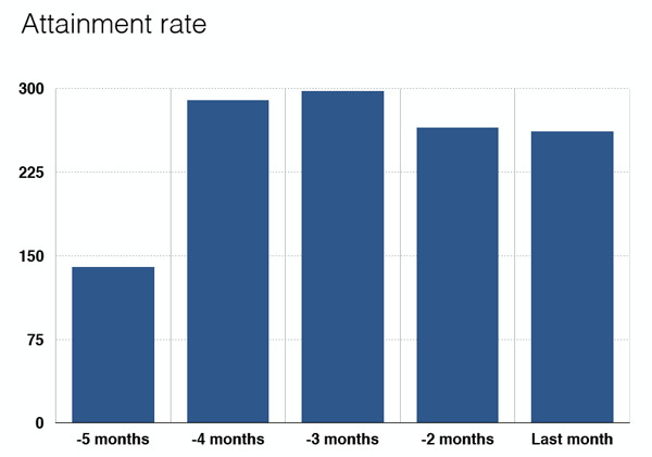
Not bad! Looks like we did something about 5 months ago that engaged a lot of people. Sure, we've come down off that spike a bit but the attainment rate has stabilized. This might give us a nudge toward making some adjustments, but there's no cause for alarm.
Unless… I mean, it's just a thought… but could we be looking at the wrong thing?
We're looking at the wrong thing
Here we are at the first pitfall of analytics I'd like to help you avoid. It actually has nothing to do with gamification—it's a pernicious mental bug that can bite you in any situation where you have a simple visualization like the one above. The graph above is of questionable value at best; at worst, it is disastrously misleading. What it's missing is cohort analysis.
In the chapter on “innovation accounting” in his seminal book The Lean Startup, Eric Ries makes a persuasive case for taking a naive trend line and breaking it down according to some relevant grouping. Cohorts can be based on demographics such as sex and age, but in many situations, it's better to group users based on some behavioral metric. For our scenario, I'd like to propose that we group our users by badge tenure: how long ago a given user first earned a badge. This is essentially the same as when they started participating. Let's break down the attainment rate by groups of users who earned their first level of this badge more than a year ago, 9–12 months ago, and so on.
Now there's cause for alarm
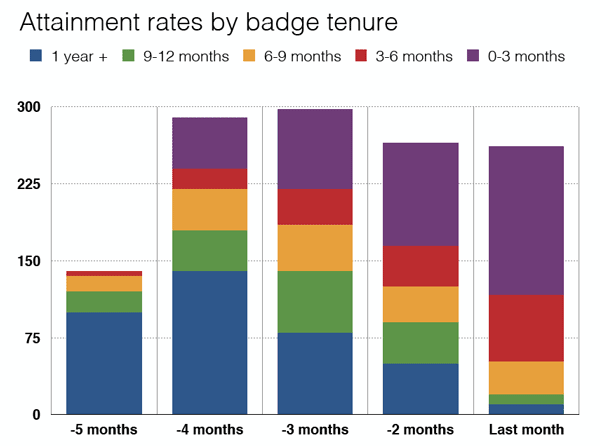
The overall contour of this graph is identical to the first one. However, it's immediately apparent that most of our cohorts are disengaging tremendously and that any stability in attainment rate is due to new players. It's possible of course that we might actually be OK with this. For instance, we may be phasing out some game mechanics in favor of new ones, in which case we might not care that the most tenured players are retiring. But if we haven't made an explicit business decision like that, this graph is a picture of looming trouble.
Users who have been participating in our forums the longest are ostensibly the most valuable, but those users are no longer engaging with our reward system. New players are filling their shoes, but if the recent past is any guide, the Food Unicorn forum game will start turning them off as well. It's time for the “adjust” phase of the Implement–Monitor–Adjust loop.
The key thing is that without having done cohort analysis, we would never have truly understood what is going on in our game. Our naive attainment rate chart deceived us with a false picture of health.
Two takeaways
- First, when your system awards badge levels, consider tracking attainment rate as an indication of player engagement.
- But don't be fooled by simplistic reporting! Instead, rely on cohort analysis to cut through the fog of a naive statistic and get to the truth buried within.