In this book, you'll learn to talk to your computer. That's all programming is, by the way.
That's how the book that changed my life began.
I was fourteen and had just gotten a (literally) shiny new TRS-80 Color Computer from Radio Shack. It had fully 16K of RAM, eight bits, and a tape recorder for saving files—really. (And, it cost a boatload of money, especially considering the relative state of wealth that my family never found ourselves in.)
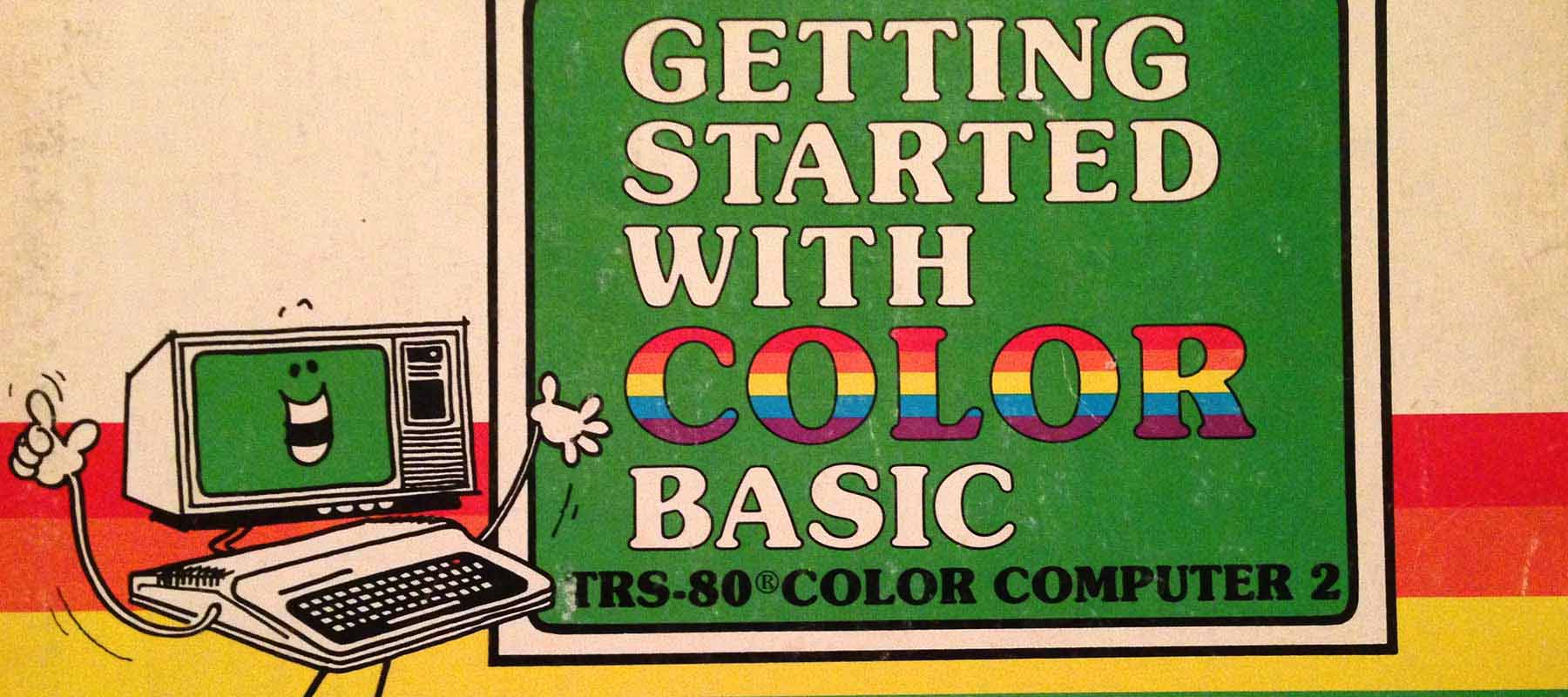
It was cool (by nerd standards), it was fun (for geeks), and just about the best thing in the package was the 300-page tutorial it came with, called Getting Started With Color BASIC.
In 24 chapters, this book changed me from someone who truly didn't know the first thing about programming into a young geek god intimate with variables, data types, flow-of-control, multidimensional arrays, reading inputs from peripherals, subroutines, and yes, even changing the color of the screen. Fifteen years later, I found that Visual Basic 6 was shockingly similar, so much so that I made the transition from music into professional programming almost by accident.
What's more, this hefty tutorial involved no heavy lifting. It was incredibly gentle yet thorough, and never scary. So many times as an adult I've found it daunting to return to a how-to book every day, yet when I was a kid all I wanted to do was plow through this amazing paperback.
Anyone responsible for technical documentation (and product managers should be) would benefit from studying Getting Started With Color BASIC to discover and try to reproduce its pedagogical magic.
How they did it: mechanics
Great technical documentation is a mixture of mechanics and content. A novel gets by with almost no mechanics (punctuation is the bulk of it), but dense topics cry out for different typographical conventions, especially considering that your audience is busy and has a ton of other information they must cram into their heads to get by in their job. Some of these mechanics will be familiar if you've used any good technical book. Here are common prescriptions for success, with some examples from Getting Started.
Code blocks
Anything that involves programming needs both character- and block-level code formatting. Getting Started used a nicely readable fixed-width font, further offset by left padding. Here on the web, blocks of code should be colorized as well. (There are a number of code colorizers out there that can easily be plugged in—there's no need to go nuts with the HTML on your own.)
Callouts
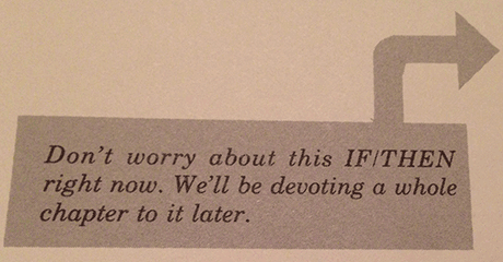
Getting Started used callouts for reminders of previous content, gentle admonitions to not worry about a
new concept that hasn't been completely explained yet, and other short bursts of parenthetical text.

Annotations
One lesson learned from Getting Started: If doing so makes it clearer, draw on it. Nested loops can be very
confusing if you've never written one, yet drawing some arrows magically makes the difficulty disappear.

Illustrations
Use drawings or other graphical treatments to elucidate a particularly dense passage or concept. Here, Getting Started
simply employs shading to make its point about string slicing.

Chapter recaps
Use bullet point summaries at the end of a "chapter" (whatever that means in your context)
to remind the reader what you've covered there. The person reading through your text for the first time is not your
only audience. Chapter recaps serve two purposes: to gracefully tie off what the new reader has just learned, and to
jog the memory of a returning reader who has forgotten some of what they knew.

Sidebars
Frequently, there will be text that presents something important, but would interrupt the main flow of learning in the body text. Lengthy parenthetical content like this can be set off in a sidebar or another type of box. You see this frequently with case-in-point examples, discussions of advanced concepts that relate to the main text but might be confusing to the novice, etc.
How they did it: content
Somewhat harder to nail is the other pillar of excellent technical documentation, content. There are few cut-and-dried rules for good content… or maybe that's wrong. Don't we know good content when we see it? Certainly, and some general guidelines must therefore exist. Here are some that can be derived from Getting Started.
- Have an authentic voice: Getting Started sparkles with wit and personality, both in the line art and prose. It can only really succeed in presenting a very difficult topic to an audience of novices because of its disarming style.
- Be results-oriented: There's a reason that just about every programming tutorial since at least 1974 starts with "Hello World"—getting something extremely minimal to execute is both illustrative and encouraging. Getting Started was no different.
- Use step-wise flow: All good teaching breaks complex subjects into digestible chunks, then lets the learner increase their knowledge and abilities step-by-step. Getting Started went effortlessly from printing static strings to doing simple math, and continuously built towards mastery in such a gradual way that any reader could hardly feel overwhelmed.
- Try to prevent error: When documenting something technical, it's simply not good enough to be thorough and accurate. Software in particular is difficult and frustrating, especially when something like a typo can be magnified into a baffling failure. Any good text will proactively anticipate trouble spots and try to prevent failure. As seen in the mechanical examples above, Getting Started took great care to use callouts containing warnings and reminders.
- Try to have some fun: Computers can be extraordinarily boring. While the goofiness of Getting Started certainly won't work for every kind of documentation, there's always an opportunity to inject at least a little bit of sly humor. (That said, like any spice, humor should be used with great caution.)
We are all 14
In general, always write for the novice but keep the "Perpetual Intermediate" in mind. (This is Alan Cooper's term that brilliantly captures the bell curve of user competency.) Chapter recaps are one way to make a text useful to both novices and intermediates, but always keep in mind that even power users will forget much of what they know as soon as they stop continuously using a program or a feature.
Above all: be humane
Every bit of this really just boils down to one thing: treat people well.
Getting Started With Color BASIC did an exceptionally good job of that, and
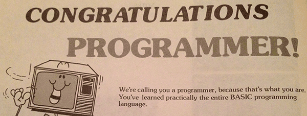
I'll leave you with perhaps the best example—this little gem, right in the middle of the book:


